Do
✓
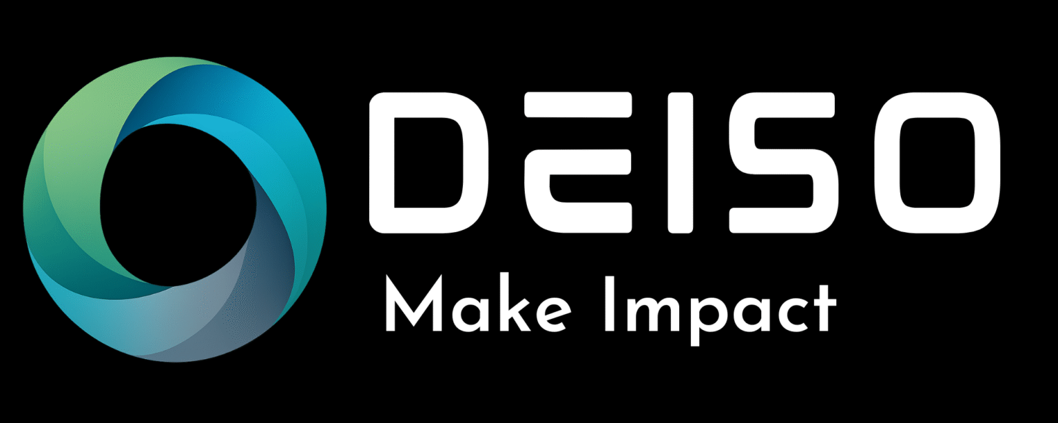
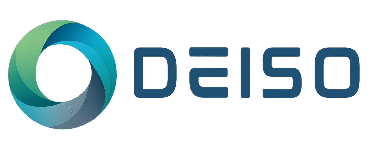
Use the version built for the background — transparent for layouts you control, white or dark for layouts you do not.
✓
Keep at least the height of the DEISO "D" as clear space around the lockup on every side.
✓
Scale proportionally. Use SVG or high-resolution PNG for any surface above 200 pixels wide.
✓
Use the navy-text versions on light backgrounds and the white-text versions on dark backgrounds — never the reverse.
✓
Pair DEISO content with the locked brand colors listed above.
Don't
✕
Recolor the symbol, the wordmark, or the slogan — including single-color or one-tone variations.
✕
Rotate, skew, distort, add drop shadows, outer glows, or 3D effects to the mark.
✕
Reconstruct the wordmark in a different typeface or alter the slogan text.
✕
Use the symbol-only mark in external partner, supplier, or client materials without written authorization.
✕
Place the mark on a background that reduces contrast below readable levels — busy photography, low-contrast gradients, or matching brand colors.